Build a rail menu in WinUI
I wanted to build my next app in WinUI, and I wanted to have a rail menu, with big clickable icons that would navigate to a different page. AI Dev Gallery has a great example of this, and fortunately it is all open-source. In this post I will show you how you can replicate this in your own WinUI app.
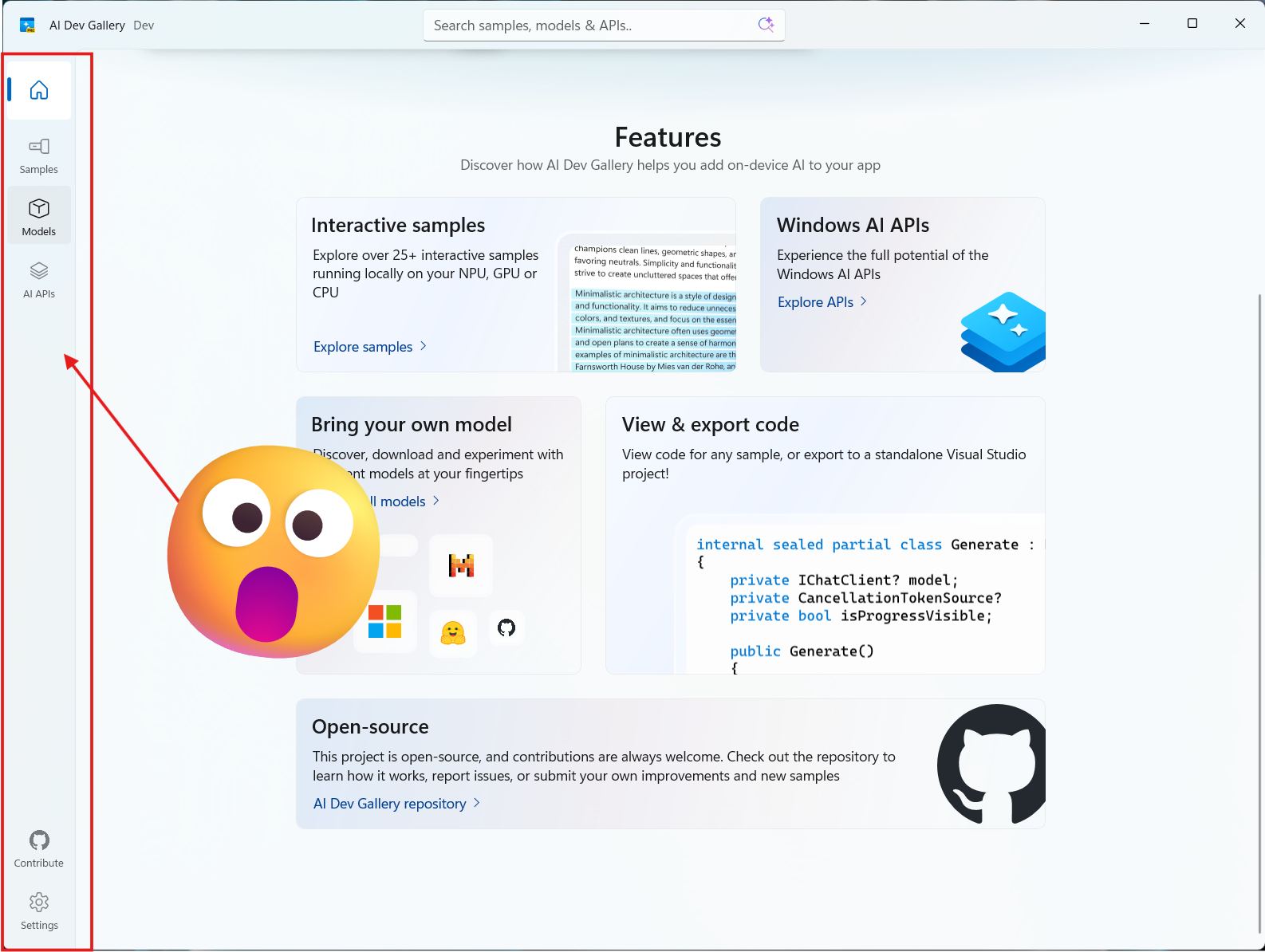
AI Dev Gallery Menu
Manual figuring it out
I started by looking at it manually, and quickly found out is was not that easy as i thought it would be. Consider attempt number one a failure. Figuring out how the layout worked by just looking at the xaml did not really help me understand how the menu was built, since I never built a WinUI app before I was kind of lost.
AI to the rescue
It is all AI these days, the app I was borrowing the design from is called AI Dev Gallery, so I thought why not use AI to figure out how to build the menu and get rid off all the things that were not related to the menu. I used the following prompt (with Claude Opus 4.6):
This application has a tiled navigation bar on the left side, can you make a details description in markdown how to replicate that in another winui application. Including all the files needed to replicate this
The result was pretty good, it gave me a detailed description of how the menu was built, it also gave me all the code needed to replicate this in my new WinUI app. I did need to make some adjustments to the code, but especially the description of what was happening in the code was very helpful to understand and replicate the menu in my own app.
Building the menu
In these 7 steps I will show you how to go from a blank WinUI app to an app with a rail menu like the one in the AI Dev Gallery. I will not go into details about how to build the pages that are navigated to, but I will show you how to set up the navigation and the menu.
1. Create a new WinUI application
First, you need to create a new WinUI application. You can do this in Visual Studio by selecting “Create a new project” and then choosing “Blank App, Packaged (WinUI 3 in Desktop)”. Follow the prompts to set up your project.
2. Modify the project file
Some packaged need to be replaced and some need to be added, here is the complete list of used packages in my project file:
  <PackageReference Include="Microsoft.Windows.SDK.BuildTools" Version="10.0.28000.1721" />
  <PackageReference Include="Microsoft.Windows.SDK.BuildTools.MSIX" Version="1.7.260316102">
    <PrivateAssets>all</PrivateAssets>
    <IncludeAssets>runtime; build; native; contentfiles; analyzers; buildtransitive</IncludeAssets>
  </PackageReference>
  <PackageReference Include="Microsoft.WindowsAppSDK" Version="1.8.260317003" />
	<PackageReference Include="CommunityToolkit.WinUI.Animations" Version="8.2.251219" />
	<PackageReference Include="CommunityToolkit.WinUI.Extensions" Version="8.2.251219" />
  <PackageReference Include="WinUIEx" Version="2.9.0" />
Not all these changes are related to the menu, I might also have included the correct versions of packages that help with building/packaging apps, but more on that later.
3. Create the NavItemIconHelper class
using Microsoft.UI.Xaml;

namespace MyApp.Helpers;

internal class NavItemIconHelper
{
    // The icon shown when the item IS selected (accent colour)
    public static object GetSelectedIcon(DependencyObject obj) =>
        obj.GetValue(SelectedIconProperty);
    public static void SetSelectedIcon(DependencyObject obj, object value) =>
        obj.SetValue(SelectedIconProperty, value);
    public static readonly DependencyProperty SelectedIconProperty =
        DependencyProperty.RegisterAttached(
            "SelectedIcon", typeof(object), typeof(NavItemIconHelper),
            new PropertyMetadata(null));

    // The icon shown when the item is NOT selected
    public static object GetUnselectedIcon(DependencyObject obj) =>
        (object)obj.GetValue(UnselectedIconProperty);
    public static void SetUnselectedIcon(DependencyObject obj, object value) =>
        obj.SetValue(UnselectedIconProperty, value);
    public static readonly DependencyProperty UnselectedIconProperty =
        DependencyProperty.RegisterAttached(
            "UnselectedIcon", typeof(object), typeof(NavItemIconHelper),
            new PropertyMetadata(null));

    // Controls Visibility of the static-icon Viewboxes (Collapsed by default;
    // set to Visible on items that use the SelectedIcon/UnselectedIcon pair)
    public static Visibility GetStaticIconVisibility(DependencyObject obj) =>
        (Visibility)obj.GetValue(StaticIconVisibilityProperty);
    public static void SetStaticIconVisibility(DependencyObject obj, Visibility value) =>
        obj.SetValue(StaticIconVisibilityProperty, value);
    public static readonly DependencyProperty StaticIconVisibilityProperty =
        DependencyProperty.RegisterAttached(
            "StaticIconVisibility", typeof(Visibility), typeof(NavItemIconHelper),
            new PropertyMetadata(Visibility.Collapsed));

    // Optional notification dot on an item
    public static bool GetShowNotificationDot(DependencyObject obj) =>
        (bool)obj.GetValue(ShowNotificationDotProperty);
    public static void SetShowNotificationDot(DependencyObject obj, bool value) =>
        obj.SetValue(ShowNotificationDotProperty, value);
    public static readonly DependencyProperty ShowNotificationDotProperty =
        DependencyProperty.RegisterAttached(
            "ShowNotificationDot", typeof(bool), typeof(NavItemIconHelper),
            new PropertyMetadata(false));
}
4. Create a NavigationView xaml file
Most of the code that styles the menu is in the file, NavigationView.xaml, this file contains the xaml code for the menu, and the styles that are used to style the menu. You can find the complete code for this file in the AI Dev Gallery repository. Go ahead and create this file in your project called Styles\NavigationView.xaml, and copy the code from the repository.
You’ll need to change the namespace in the xaml header to match your project, so change xmlns:helpers="using:AIDevGallery.Helpers" to xmlns:helpers="using:MyApp.Helpers".
5. Modify App.xaml to include the new styles
<Application.Resources>
    <ResourceDictionary>
        <ResourceDictionary.MergedDictionaries>
            <XamlControlsResources xmlns="using:Microsoft.UI.Xaml.Controls" />
            <!-- your other resource dictionaries, add the next line, this is why the filename is important -->
            <ResourceDictionary Source="/Styles/NavigationView.xaml" />
        </ResourceDictionary.MergedDictionaries>
    </ResourceDictionary>
</Application.Resources>
6. Modify MainWindow.xaml to include the NavigationView
This will also change the main window to use the WindowEx class from the WinUIEx package, this is not required to build the menu, but it gives you some nice features like the Mica backdrop and rounded corners.
<winuiex:WindowEx
x:Class="MyApp.MainWindow"
xmlns="http://schemas.microsoft.com/winfx/2006/xaml/presentation"
xmlns:x="http://schemas.microsoft.com/winfx/2006/xaml"
xmlns:ui="using:CommunityToolkit.WinUI"
xmlns:winuiex="using:WinUIEx"
Width="1280"
MinWidth="900">
<Window.SystemBackdrop>
<MicaBackdrop />
</Window.SystemBackdrop>
<Grid>
<Grid.RowDefinitions>
<RowDefinition Height="Auto" />
<RowDefinition Height="*" />
</Grid.RowDefinitions>
<!-- This is the navigation view, this is the main part of the menu, it contains the menu items and the content frame where the pages will be displayed, you can customize the menu items and the content frame to your liking -->
<NavigationView
x:Name="NavView"
Grid.Row="1"
IsBackButtonVisible="Collapsed"
IsPaneToggleButtonVisible="False"
IsSettingsVisible="False"
ItemInvoked="NavView_ItemInvoked"
Style="{StaticResource MainNavigationViewStyle}">
<NavigationView.MenuItems>
<NavigationViewItem Content="Home" Icon="Home" Tag="Home" />
<NavigationViewItem Content="Browse" Icon="{ui:FontIcon Glyph=}" Tag="Browse" />
<NavigationViewItem Content="Models" Icon="{ui:FontIcon Glyph=}" Tag="Models" />
</NavigationView.MenuItems>
<NavigationView.FooterMenuItems>
<NavigationViewItem Content="Settings" Icon="Setting" Tag="Settings" />
</NavigationView.FooterMenuItems>
<NavigationView.Content>
<Frame x:Name="NavFrame"
Navigated="NavFrame_Navigated" />
</NavigationView.Content>
</NavigationView>
<!-- This is the title bar, this is not required to build the menu, but it gives you a nice title bar with an icon, you can customize this to your liking -->
<TitleBar x:Name="titleBar" Grid.Row="0" Title="MyApp" Height="48" IsTabStop="False">
<!--IsBackButtonVisible="{x:Bind NavFrame.CanGoBack, Mode=OneWay}"-->
<TitleBar.LeftHeader>
<Image
x:Name="titleBarIcon"
Width="16"
Margin="16,0,0,0"
AutomationProperties.AccessibilityView="Raw"
Source="ms-appx:///Assets/Square44x44Logo.png" />
</TitleBar.LeftHeader>
</TitleBar>
</Grid>
</winuiex:WindowEx>
7. Modify MainWindow.xaml.cs to handle navigation
using Microsoft.UI.Xaml;
using Microsoft.UI.Xaml.Controls;
using WinUIEx;

namespace MyApp;

// Base class changed from Window to WindowEx to get access to some nice features like Mica backdrop and rounded corners, but this is not required to build the menu
internal sealed partial class MainWindow : WindowEx
{
    public MainWindow()
    {
        this.InitializeComponent();
        SetTitleBar();
        NavView.Loaded += (s, e) => NavFrame.Navigate(typeof(Pages.HomePage));
    }

    // Handle navigation when a menu item is clicked
    // Navigation is based on the Tag property of the NavigationViewItem, which is set in the xaml
    private void NavView_ItemInvoked(NavigationView sender, NavigationViewItemInvokedEventArgs args)
    {
        var tag = args.InvokedItemContainer?.Tag?.ToString();
        switch (tag)
        {
            case "Home":    NavFrame.Navigate(typeof(Pages.HomePage));    break;
            case "Browse":  NavFrame.Navigate(typeof(Pages.BrowsePage));  break;
            case "Models":  NavFrame.Navigate(typeof(Pages.ModelsPage));  break;
            case "Settings":NavFrame.Navigate(typeof(Pages.SettingsPage));break;
        }
    }

    // This is not strictly needed for the menu, but the AI Dev Gallery has child pages that you can navigate to, and without this code the correct menu item would not be highlighted when you navigate back to the main pages, so I added this to keep the correct item highlighted after back-navigation.
    private void NavFrame_Navigated(object sender, Microsoft.UI.Xaml.Navigation.NavigationEventArgs e)
    {
        // Keep the correct item highlighted after back-navigation
        foreach (var item in NavView.MenuItems.OfType<NavigationViewItem>())
        {
            if (item.Tag?.ToString() == GetTagForPage(e.SourcePageType))
            {
                NavView.SelectedItem = item;
                break;
            }
        }
    }

    // This method is used to get the tag for a given page type, this is used in the NavFrame_Navigated method to keep the correct item highlighted after back-navigation, you can adjust this method to match your own page types and tags
    private static string? GetTagForPage(Type page) => page.Name switch
    {
        nameof(Pages.HomePage)    => "Home",
        nameof(Pages.BrowsePage)  => "Browse",
        nameof(Pages.ModelsPage)  => "Models",
        nameof(Pages.SettingsPage)=> "Settings",
        _ => null
    };

    // Not strictly needed for the menu, but this sets up the title bar with an icon and a title, you can customize this to your liking, or remove it if you don't want a custom title bar
    private void SetTitleBar()
    {
        this.ExtendsContentIntoTitleBar = true;
        this.SetTitleBar(titleBar);
        this.AppWindow.TitleBar.PreferredHeightOption = TitleBarHeightOption.Tall;
        this.AppWindow.SetIcon("Assets/AppIcon/Icon.ico");

        this.Title = Windows.ApplicationModel.Package.Current.DisplayName;
    }
}
Conclusion
And that is it, how ironic, I used AI to figure out how to build a menu that it used in the AI Dev Gallery. I really like this menu, it makes your app shine. And now that I’m back into building desktop apps with WinUI, I cannot wait to release more applications for the Windows platform. I’m all excited about this platform, building beautiful desktop applications has never been easier. Unfortunately, these apps are not cross-platform, but for now I’m fine with that.
One feedback thing about WinUI, just include this menu in the default templates, or even better, make it a control in the WinUI library. It is a nice menu, and I really prefer not to have 1697 lines of xaml to get it working.
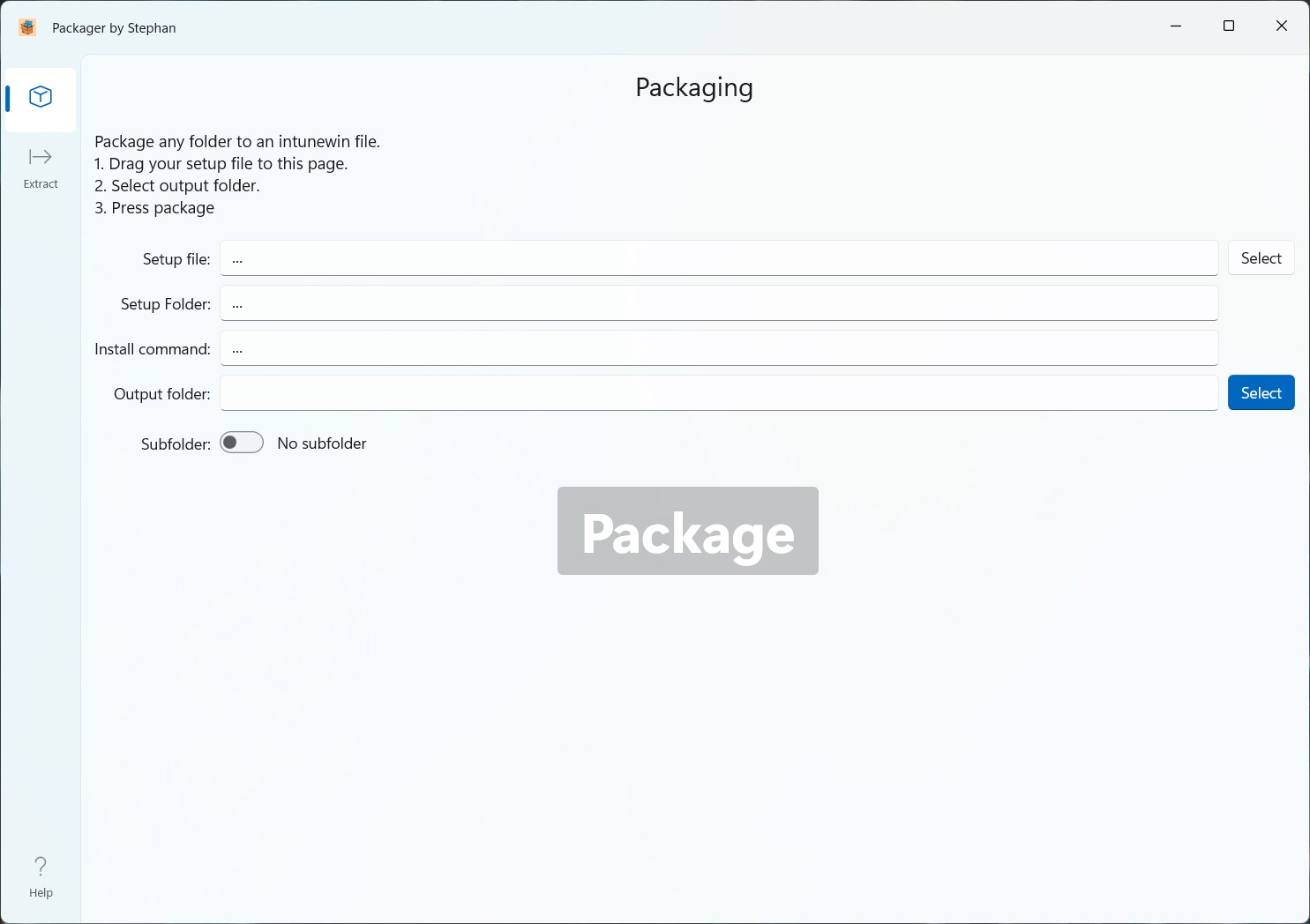
If you’re an Intune admin, you might like my just released Packager by Stephan, it allows you to easily package any installer or script to an Intune package ready for uploading.